Portfolio I: The Wedding Venue
Overview
Design Challenge
How might we create a centralized platform that allows both in-person and virtual clients to easily browse and select wedding vendors while reducing the organizational burden on the wedding planner?
Project Duration
January 2024 – December 2024
My Role
Lead UX Designer responsible for research, wireframing, lo-fi prototypes, mockups, and hi-fi prototypes.
Research Summary
Problem Statement
The wedding planner was experiencing challenges managing and organizing the large number of vendors and products associated with each event. They needed a more efficient way for clients to browse, compare, and review vendor options throughout the planning process.
Pain Points
The wedding planner wanted a solution that could effectively serve two different types of clients:
- In-Person Clients: Individuals who have the time and flexibility to meet face-to-face and review vendors and products during appointments.
- Virtual Clients: Busy individuals who may not be able to attend in-person meetings but still want a seamless planning experience and the opportunity to create their dream wedding remotely.
The goal was to design a user-friendly platform that would allow both client groups to easily explore vendors, review products, and make informed decisions regardless of how they chose to engage with the wedding planner.
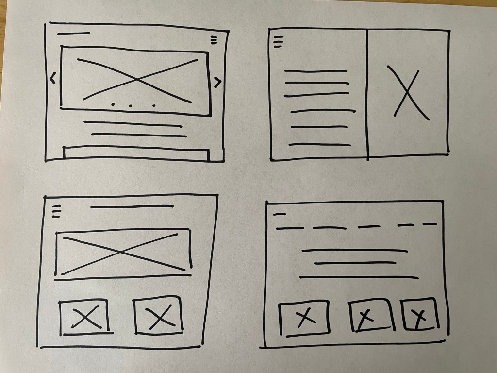
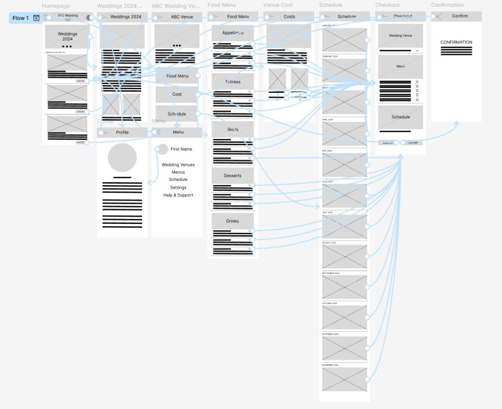
Paper Wireframes
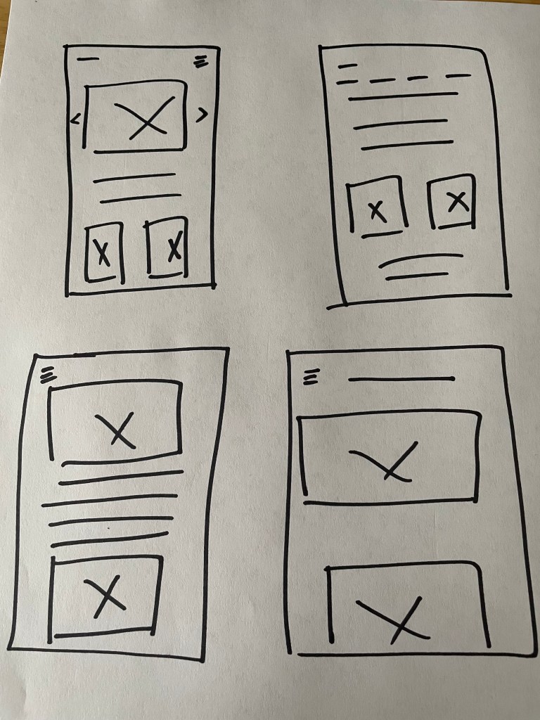
Digital Wireframe
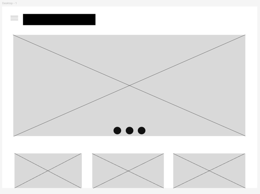
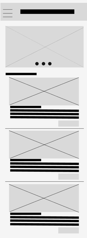
Lo-Fi Prototype
Usability Study
Study Parameters
- Study Type: Unmoderated usability study
- Location: Remote (United States)
- Participants: 10 users
- Duration: 20–30 minutes per session
Key Findings
1. Navigation Challenges
- Participants experienced difficulty navigating the website’s menu structure and often struggled to locate specific sections and features. This created frustration and increased the time needed to complete tasks. Many users reported that they frequently had to click the browser’s back button to navigate between pages, rather than having an intuitive way to move throughout the website.
2. Complex Checkout Process
- Users found the checkout flow to be overly complicated, with multiple unnecessary steps. Several participants expressed uncertainty during the process, increasing the likelihood of cart abandonment before completing a purchase.
3. Mobile Responsiveness Issues
- Participants accessing the website on mobile devices reported usability concerns, particularly on smaller screens. Interface elements were difficult to interact with, which negatively impacted task completion and the overall user experience.
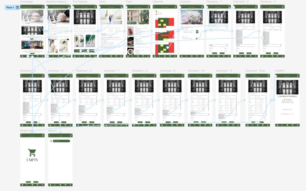
Hi-Fi Prototype
Accessibility Considerations
How to ensure that the website is accessible for all users:
Readable Content
- Ensure that text is easy to read by providing sufficient contrast between text and background colors. The design also supports scalable text, allowing users to adjust font sizes for improved readability.
Keyboard Accessibility
- Implement keyboard navigation so that all interactive elements, such as menus, buttons, and forms, can be accessed without a mouse. This supports users with mobility limitations and those who rely on keyboard-only navigation.
Alternative Text and Media Accessibility
- Provide descriptive alternative text for images and include captions or transcripts for video and audio content. These features support users who rely on screen readers or other assistive technologies to access non-text content.
By prioritizing accessibility, the website is designed to provide a welcoming and functional experience for a diverse range of users, regardless of their abilities or the devices they use.
Takeaways
Impacts:
- Improve the mobile experience through responsive design enhancements and optimized touch targets.
- Simplify the navigation structure and add persistent menu options to reduce unnecessary backtracking.
- Streamline the checkout process by minimizing the number of steps required to complete a purchase.
What I learned:
Throughout the process of designing this responsive website, I learned the importance of creating flexible layouts, using scalable images, and implementing responsive design principles to ensure a consistent experience across desktops, tablets, and smartphones.
I also gained a deeper appreciation for the value of usability testing across multiple devices and user groups. Feedback from participants helped identify navigation issues, mobile usability concerns, and pain points within the checkout process, allowing me to make informed design improvements.
One of the biggest challenges was developing an elegant and cohesive color palette that reflected the wedding planner’s brand while maintaining visual consistency throughout the website. I also learned how critical information architecture and user flow are in reducing frustration. By simplifying navigation and creating a more intuitive experience, I was able to design a website that better supports both in-person and virtual clients as they plan their weddings.
Personal Reflection:
This project reinforced that successful UX design is not only about aesthetics; it is about creating intuitive, accessible, and user-centered experiences that help people accomplish their goals with confidence.
 Kazoua Vang